

How many customers are you losing because of poor contact options?
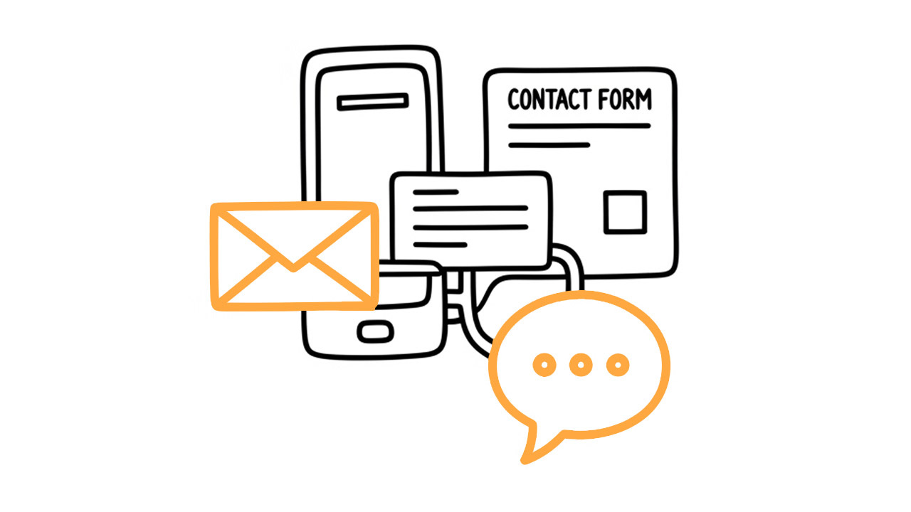
Multiple contact options = more customers. Phone, email, chat, forms - each catches different people. Don't lose prospects over poor UX.

Hey marketer! 👋🏻
Imagine you want to contact a company. You personally might prefer to call because you want an answer right away. Your wife might prefer to write an email so she can think through what she wants to say. Your dad might look for a phone number because he doesn't use email much. And your daughter? She'd rather text in a chat and get an answer within a minute.
Each of us prefers a different communication style. Yet many websites offer only one way to contact them - typically an email buried somewhere in the footer. This means they're unnecessarily missing out on potential customers.
It doesn't mean no one contacts them. But how many people simply close their website and go to a competitor because they couldn't find a contact method that suits them? How many business opportunities slip away like this? It's like having a store that only accepts Bitcoin payments - sure, some people will appreciate it, but many customers will just go elsewhere.
Different people, different preferences
📞 Those who prefer phone calls Some people simply want to resolve things immediately and personally. This might be older generations who are used to phones, or anyone who needs a quick answer or wants to discuss details right away. When someone is browsing your website on mobile, it's easiest for them to just click and call. For them, the phone number must be visible and, most importantly, clickable (as a tel: link).
📧 Those who prefer writing emails Another type of person prefers written communication. They can think through what they want to write, attach files, and return to it later. Some simply don't like phone calls - maybe they're introverts or want things in black and white. For them, a visible email address that opens their email client when clicked is ideal.
📝 Those who prefer filling out forms Another group prefers contact forms directly on the website. Maybe they don't have email access at the moment, can't copy an address, or it just seems more convenient - fill out a few fields and send. For us as website operators, forms have the advantage that we can get all necessary information right the first time through specific questions. But be careful - we must reduce their uncertainty. Clearly state that the form works and someone reads it, how soon you'll respond, and ideally send them an email copy of what they filled out. So they know their message arrived.
💬 Those who want quick responses And then there are people who appreciate immediate interaction. Maybe they couldn't find something on the website, have an unusual question, or just need quick reassurance. Chat is a great way to capture prospects who might not contact you otherwise. But be careful - it only makes sense if you can respond quickly. And it's good to have clear rules. Customer chat serves to capture contact and answer basic questions, but redirect complex matters to email or phone. Otherwise, you'll just be answering questions and giving away information for free instead of selling.
How to do it practically?
1. Give people choices At minimum phone, email, and form. Chat is a bonus, but it pays off mainly for e-shops or services (like custom manufacturing).
2. Be visible Contacts don't belong only in the footer. Put them in the header, at the end of every important page, in the sidebar. Simply where people will look for them.
3. Make action easy
Phone must be clickable (tel: link)
Email too (mailto: link)
Form short and clear
Chat visible but not annoying
4. Test and measure Track which channels bring you how many inquiries and what types of customers. Google Analytics will show you how many people clicked on phone or email. With forms and chat, you see it directly. Based on that, you can then adjust what you highlight or where you place it.
UX isn't a dirty word
All of this falls under UX - User Experience. It's not rocket science - it's simply about people being able to navigate your website and easily do what they need. In this case - contact you.
Remember: People are lazy (including me and you). If you don't make it easy for them, they'll find someone who will. So don't give people a reason to go to competitors just because you didn't offer their preferred communication method.
Think about all types of people
Try looking at your website through the eyes of different people (who fall into your target audience):
👵 Grandma → can she easily find the phone number?
🚄 Manager on a train → can he quickly write to you via chat?
😶 Introvert → does she have the option to write an email or form?
📱 Mobile user → are contacts clickable?
🌙 Sunday evening visitor → can he write to you even when you don't answer the phone?
🏢 Company → can they find email for an official quote?
Find a balance between how you want to communicate and how your customers want to communicate. Some prefer voice, some text, some want speed, some want to think things through. At the same time, it's clear you can't cover absolutely everything - choose communication methods you can handle with quality service.
The more relevant options you offer, the greater chance you have that exactly the customer you're looking for will contact you. But be careful - every channel you offer, you must be able to reliably service. Better to have three functional contact methods than five, two of which you ignore.
☕ Enjoying the content? Support the project!
Help me keep creating practical marketing content by buying me a coffee. Every cup fuels more articles, tips, and resources for fellow entrepreneurs like you!

That's all for today! Go check your website and see how many contact options you're offering. Your future customers will thank you.
Jan Barborik
P.S.: If you enjoyed this article, forward it to a friend.
If you're that sexy friend, subscribe here.