

How to Build a Website Simply, Quickly, and Well?
Learn a proven approach to website creation that prioritizes content over design. Build better sites faster with this practical method.

Hey marketer! 👋🏻
One of the main things I've been doing for almost two decades is building websites. Today I want to share my approach to website creation with you. Over the years, I've simplified and automated it so that even when working with a low budget, the result will be as good as possible.
After all, as a marketer or entrepreneur, you'll sooner or later find yourself in a situation where you need a (new) website. Whether it's a microsite for a campaign or new company pages. And you don't always have a team of specialists and a generous budget at your disposal.
Fortunately, we live in a time when there are plenty of tools that make your work easier. Website creation is no longer about programming, but mainly about assembling content.
Forget About Graphics, Start With Content
When someone says "new website," many people immediately start thinking about how the website should look. What colors it will have, where the logo will be, what animations there will be. Stop! That's exactly the opposite approach to what you need. A website is primarily a carrier of information. Website success is rarely dependent on its graphics. People don't visit websites to admire them. They go there for answers and solutions to their problems.
In my worldview, website must work even in black and white, in basic font.
When you have a well-structured layout, perfectly described and photographed products or services you offer, the website will simply have to work. And whether it's blue or red won't fundamentally earn you anything more. Conversely, if you only focus on graphics and the content sucks, the website will be useless.
Sure, let it not be embarrassing, aesthetically polished, adapted to the industry you operate in and your visual identity. But that comes last.
Structure as Foundation
The first step in website creation should therefore be creating a mind map. In it, you'll outline what pages the website will have and what content will be on them.
For each page, note what information it should contain, what elements you want there (forms, galleries, testimonials...) and what the visitor should do on the page. This will give you a clear initial idea of the project scope. Website creation will be guided by this.
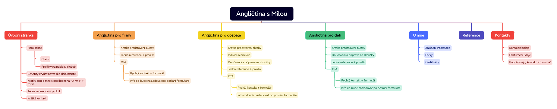
I use Xmind for creation, which can be easily shared with the team or client.
Then Prepare Your Information
With the prepared structure, it's time to prepare materials. At least the factual and rough ones. You need texts, photos, testimonials, contacts... in short, everything that will form the website content. Try to prepare the maximum right at the beginning. It doesn't have to be final and perfect texts. But you should have at least bullet points about what they'll cover. If you don't have all materials, at least note what will be there and approximately what scope. Even amateur photos are fine if the professional ones will come later.
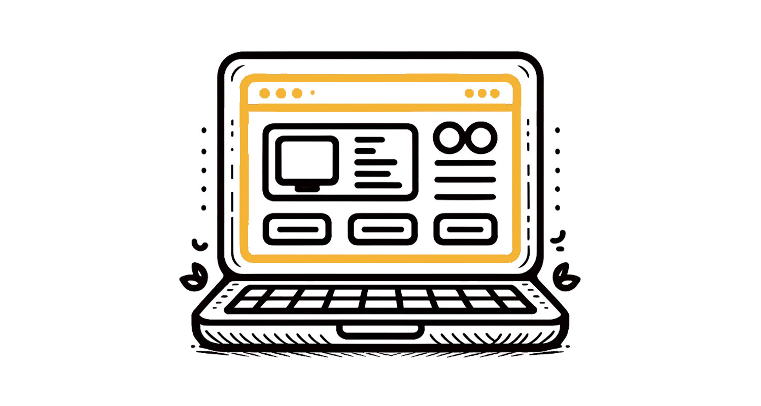
Quick Prototype Shows More Than Planning
Once you have materials, you can start creating. Thanks to tools like WordPress (I almost exclusively use the Divi template), you can quickly assemble a functional website prototype. I first install a clean WordPress installation with DIVI, start creating page structure, create a menu, and roughly upload the materials I have without any styling.
Don't worry about graphics at this stage - the point is that the information as a whole and its arrangement makes sense. The advantage is that with minimal effort you see a real website, you can click through it and better imagine the final form. And you have time to reconsider or adjust what goes where.
You can even test on real people whether the structure makes sense, whether any important information is missing, whether the website is easy to navigate, and what scope of texts you'll need where. It's much easier to make changes at this stage than when you have finished graphics.
Content Refinement
If everything is as you need it, it's time to work on the final content form. Fill in final text versions, upload correct photos, play with link text, buttons, forms... Set preview photos for articles. So that when browsing, the visitor already sees the content that should ultimately be there.
When you think about it, websites like Apple's, Notion's, Basecamp's, or Dropbox's don't really have much graphics. They're polished, with nice typography... but the rest is minimalistic. They're built on great texts and excellent photos. You see that those little colors don't have that much influence on communication quality?
Graphics as the Last Step
So only when you have confirmed and tested content, get into graphic adjustments. At this point, you already know exactly what you're styling - you know text lengths, number of images, different content types. You can either style directly on the website and create graphics "on the go," or prepare a graphic design based on the development version of pages and then style that.
Although I'm an advocate of the "content first" approach, it doesn't mean the graphic appearance of the website isn't important. It's like building a house - first you need a functional house you can live in, and then you can paint and furnish it. The website must be visually attractive and professional in its final form. But this is the last step in the process.
That's why even if a graphic designer is working on the website, the brief for them should be that final content form. So they know what they're designing. Otherwise, they'll be creating blindly - and possibly unnecessarily. Or you'll then try to forcefully graft your content into a design created without context.
Why Does This Approach Work?
If you had a team of pros, you'd do all this too. Just separately. First research and analysis, structure, wireframe design and testing, then copywriting, graphic design, and according to that, the website would be programmed.
This way, with minimal time intensity, you're able to have a live website prototype with rough content for testing. Thanks to current tools (no-code / low code), the technical side of website creation is much simpler than before.
The real challenge is creating quality and functional content. And that's what you should focus on primarily when creating a website. That's where I see the main role of today's marketer.
Your customers and website visitors ultimately won't care what platform it runs on or how much money it cost. They'll care about whether they find what they were looking for. And whether you engage them.
That's my approach to website creation in a nutshell.
☕ Enjoying the content? Support the project!
Help me keep creating practical marketing content by buying me a coffee. Every cup fuels more articles, tips, and resources for fellow entrepreneurs like you!

Have a beautiful summer and I look forward to the next article!
Jan Barborik
P.S.: If you enjoyed this article, forward it to a friend.
If you're that sexy friend, subscribe here.
Interesting article, I specialize in creating Wordpress sites, I believe that sites need to have a good UX/UI, they need to be fast and optimized for search engines, SEO is very important.
I've seen many beautiful sites that don't perform well on the web.